My direct contributions:
- Full frontend development
- Full UX development
- Full UI development
- Schema definitions
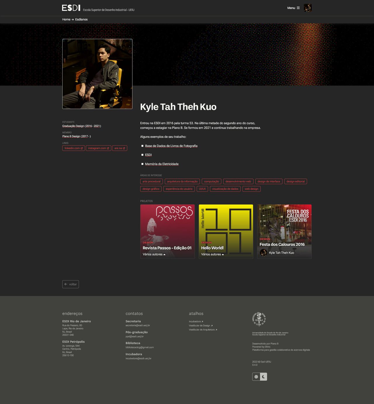
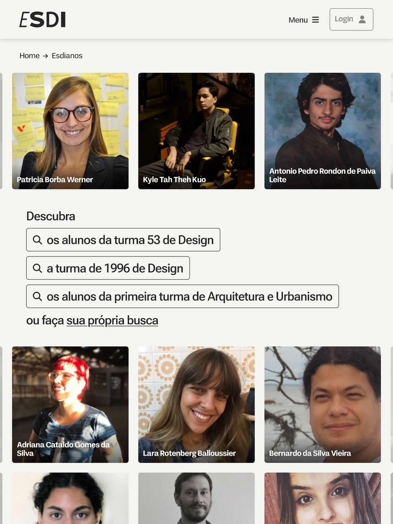
Our pitch was to build a platform to converge the “esdian” community. ESDI has a big focus on its history and community, and we just so happened to have a database filled with most students and professionals that were part of its journey.
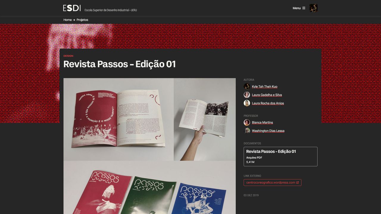
I had, admittedly, a huge bias when it came to designing this website; this project reflects my views of the time I spent in the university’s design course. The thin lines give it a wireframey feel, the sparse use of color reminds me of first-year hue studies, the use of halftones reflects the deeply rooted love of printed media in the community, the use of variable fonts - one authored by an ex-student no less - reminding us that there’s still some edge there.
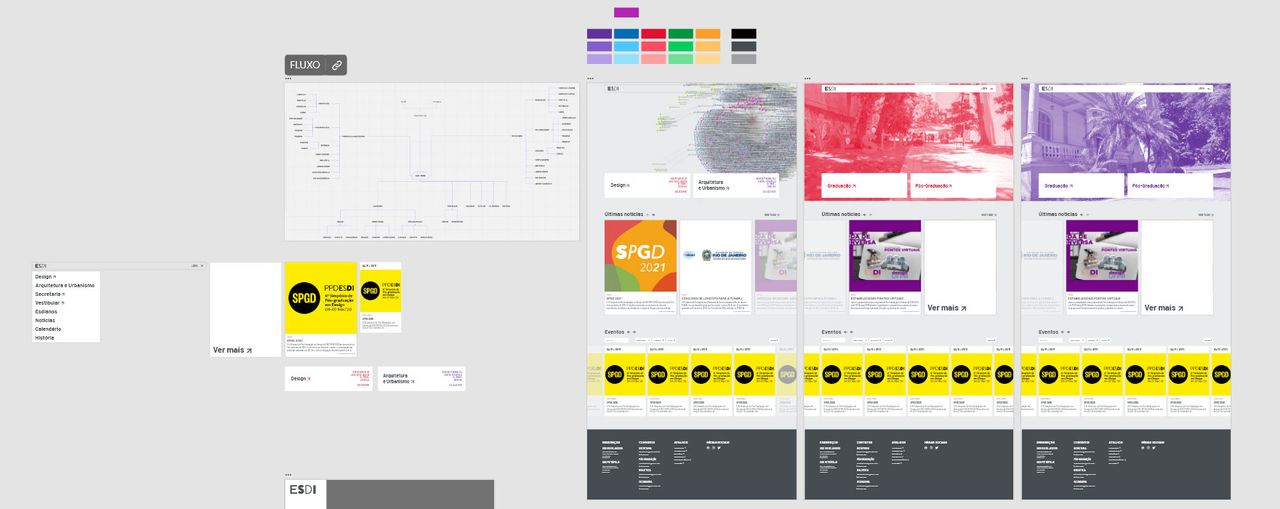
initial wireframe / prototype
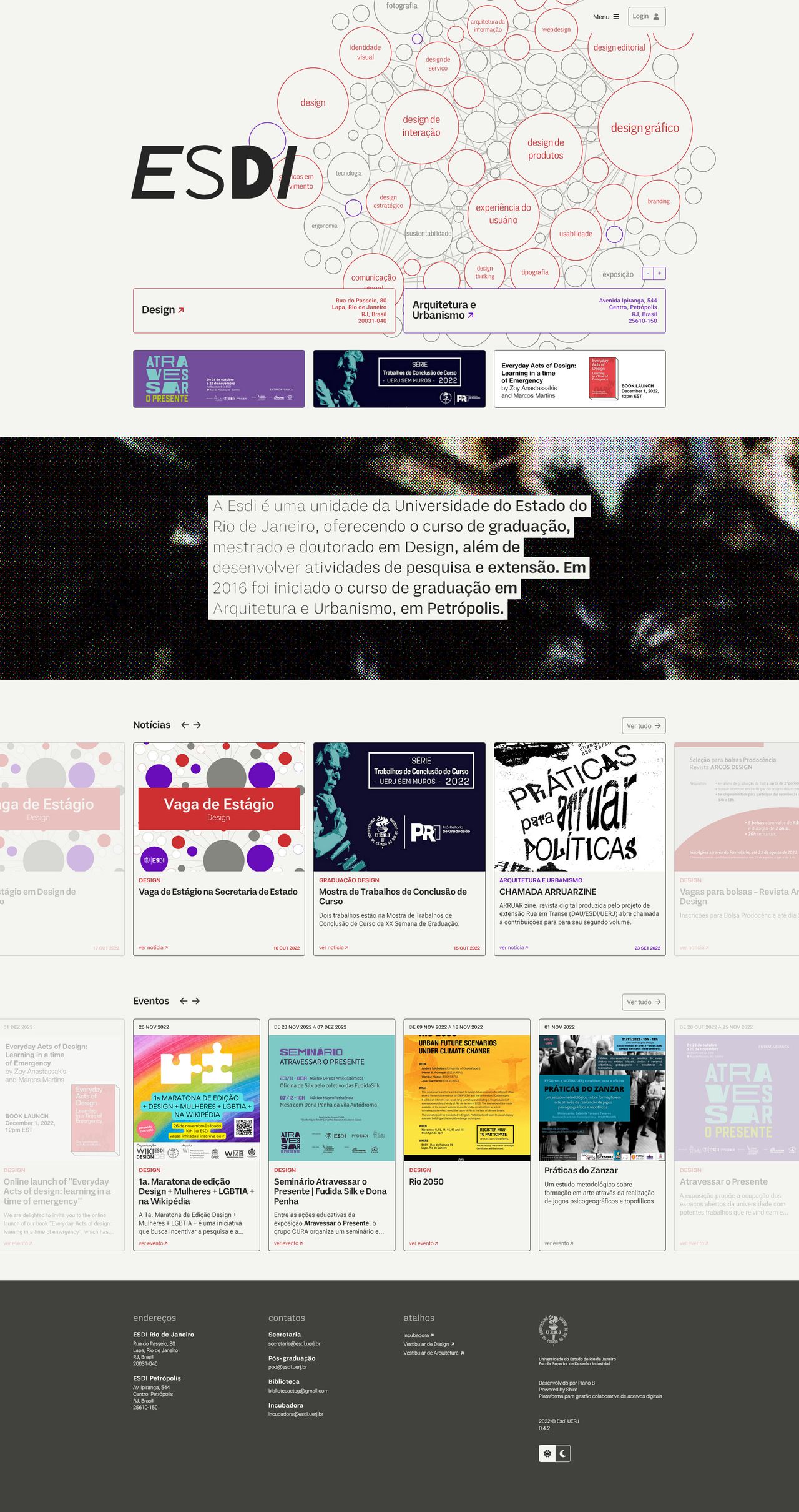
homepage
The homepage uses a D3 force many-body graph to present the many areas of interest shared by the “esdianos” and how each one co-relates to one another through the people in the community. With this type of data visualization, there’s a possibility for some insight, especially when it comes to finding unusual connections.
This project was a technical challenge: the companies’ workflow and tools don’t lend themselves too well to the usual contemporary webdev paradigms, so I had to find creative and mostly-vanilla-browser-centric ways to develop my ideas.
The palette is a good example: one of the main ideas in this layout is to visually signal ESDI’s two different courses, so I needed to create a system flexible enough to deal with this. CSS variables are widely adopted now, so I could iterate and implement my ideas without an SCSS build process. The process paid off: I was able to implement a “dark mode” in less than a day’s work.
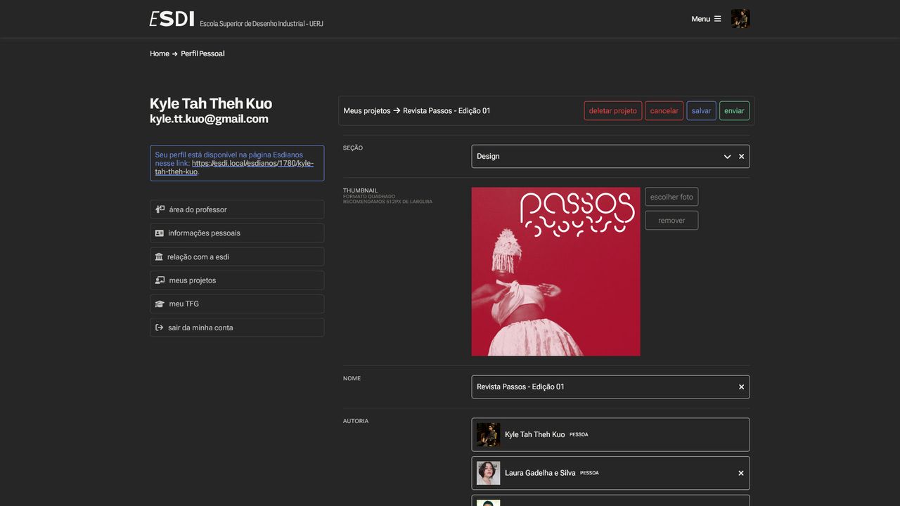
We have recently launched the User Profile, where a user can edit their info and upload their projects, creating an online portfolio.
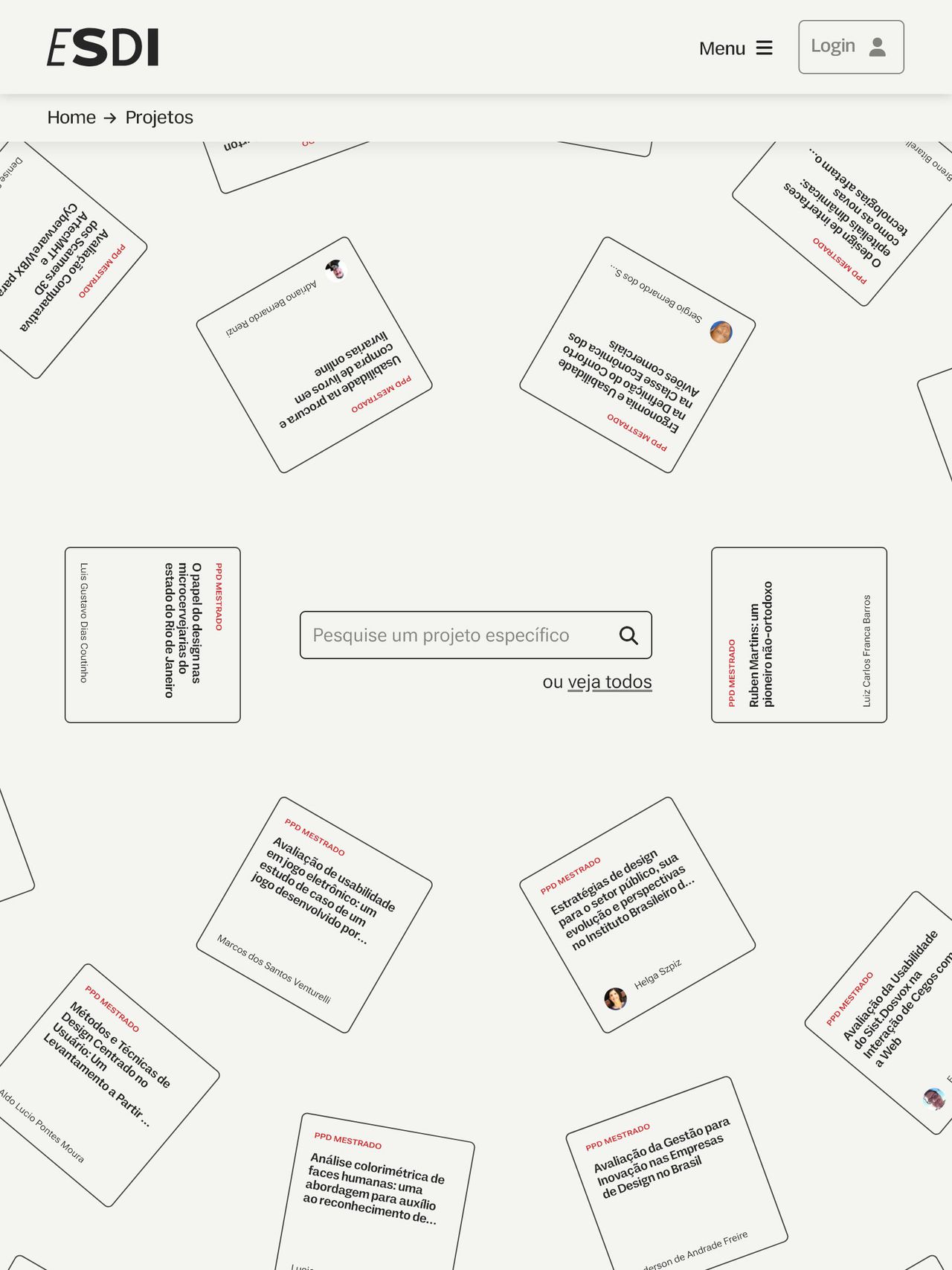
The halftone image you see on this page is created through overlay filters with some CSS to create the effect. The same component is found in other pages in conjunction with a play on variable fonts and mouse position.
variable font detail
